Product pages that answer questions before shoppers ask
Every page in your store is laid out around one idea: remove the reasons people leave. Here’s what that looks like on a real product page.


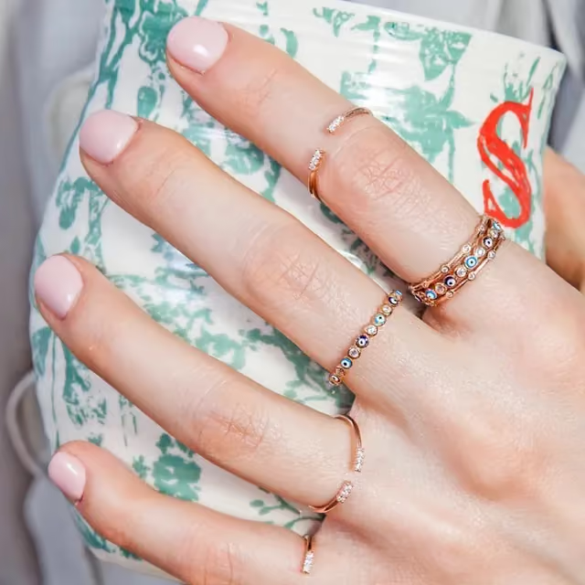


- A title that says what it isPlain words, the way people search for it.
- The price, right thereNo scrolling to find out what it costs.
- One buttonBig, thumb-friendly, always the same color.
- Delivery before doubtShipping time sits next to the button, where the question comes up.
- Answers on the pageSizing, materials and care, so nobody has to email you first.


- HomepageYour best product first, then collections and the shipping and returns info people look for.
- CollectionsGrouped the way shoppers in your niche browse.
- AboutA short brand story you can make personal.
- FAQ and policiesShipping, refunds, privacy and terms, set up in Shopify.
Product page questions
What makes a product page convert?
It answers the questions a shopper has before they have to ask: what it is, why it helps, what it costs, when it arrives and what happens if it doesn’t fit.
Which pages are included?
Homepage, collections, product pages, About, FAQ, contact and store policies.
Who writes the copy?
The AI writes it for your niche when the store is built. Edit any of it in Shopify.
Can I change the layout?
Yes, in Online Store, Themes, Customize. Drag sections around, hide what you don’t need.
Are the pages fast on mobile?
They are designed for phones first and keep heavy extras out of the way.
What should be at the top of a Shopify product page on mobile?
The main photo, the title, the price and the add to cart button. If someone has to scroll to find the button, you lose some of them. A line about shipping time near the button helps too, since it's one of the first things shoppers want to know.
How do I make a product page that converts when nobody's buying?
Look at it on your own phone like a stranger would. The usual problems: blurry or watermarked supplier photos, no shipping info, a price with no reason behind it, and a description that lists specs without saying why they matter. Fix the photos first.
How long should a Shopify product description be?
Long enough to answer what someone would ask you in a real shop. Open with a sentence or two on what it does for them, then a short list of details like size, material and what's in the box. A dog harness page needs sizing help. A phone stand mostly needs one clear photo of it in use.
What's a normal Shopify conversion rate for a brand new store?
There isn't one number worth chasing, because it swings a lot by niche, price and where your traffic comes from. Compare your store against itself instead. Note this week's rate in Shopify's Analytics, change one thing, and check again after a decent number of visits.
Open your store today.
100% FREE to build. No technical work. A Shopify store that is yours from day one.
Build my FREE store